Learn about our editorial policies and terms & conditions
Google Sheets is a popular option for creating bar charts when you need to keep your workflow inside Google Sheets. Its built-in chart tools allow you to create and update charts directly in the browser, making it useful for teams working with basic data visualization needs. Here is how to make a bar chart in Google Sheets.
- Enter categories and values in two columns.
- Select the range, click Insert, then Chart.
- In the Chart Editor, change the chart type to bar or column if needed.
- Use the Setup and Customize tabs to tune labels, colors and axes.
- Share or download the chart as needed.
Google Sheets is best suited for generic, simplistic chart creation, especially when data needs to be immediately visualized in your sheets. It's a practical choice for teams with basic data visualization needs. However if you want to enjoy more efficient data visualization and beautiful design, try
Graphitup 's free bar graph maker.
 Bar Chart Guide
 How to Make a Bar Graph in Excel
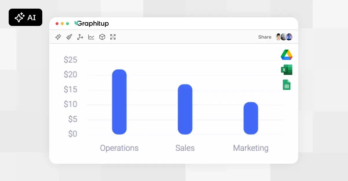 Online Bar Graph Maker - Free, No Signup