Learn about our editorial policies and terms & conditions
When visualizing trends within your Google Sheets, their pie chart tool is very for quick visuals you don't need to publish. Whether you're visualizing total sales by product, traffic by source, or workforce distribution by department, you can build a simple pie chart in just a few steps.
Here's how to make a pie chart in Google Sheets:
- Add your categories and values into two columns.
- Highlight the data and choose Insert → Chart.
- Switch the chart type to Pie Chart in the Chart Editor if it does not auto-select it.
- Customize the design through the Setup and Customize tabs, adjusting colors, labels, and slice order.
- Download the chart as an image or share the entire Google Sheet for collaboration.
While Google Sheets works well for quick internal charts, if you need a more polished pie chart for presentations or reports, try Graphitup 's pie chart maker. It offers, free to use, professional design options without the learning curve of spreadsheet tools.
 Pie Chart Guide
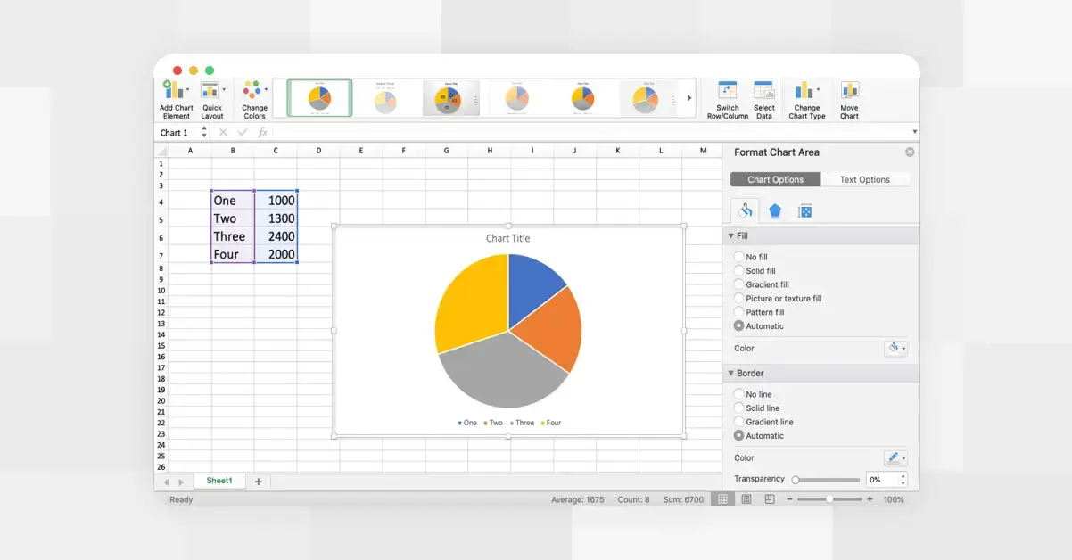 How to Make a Pie Chart in Excel
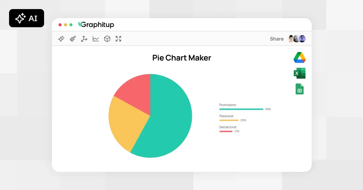 Online Pie Chart Maker - Free, No Signup