Learn about our editorial policies and terms & conditions
Excel is a familiar option for creating scatter plots, especially when you are doing quick exploratory analysis. It is a decent choice for simplistic reports, presentations, or situations where you do not want to learn another tool and don't particularly care about design.
To create a scatter plot in Excel:
- Enter your data into two columns, one for the x-axis values and one for the y-axis values.
- Highlight both columns of data.
- Go to the Insert tab in the Excel ribbon.
- Select the Scatter chart option and choose the basic scatter plot.
- Add axis titles, adjust scales, and format point size or color as needed.
- Add a trendline if it helps clarify the relationship in the data.
Excel also allows you to fine-tune axis ranges, add gridlines, and export the chart as an image or embed it into documents and slides.
Overall, Excel scatter plots work best for one-off analysis and static reporting. If you need live data updates, reusable on-themes themes, or more control over styling, a dedicated tool like our free scatter plot maker may be a better fit.
 Scatter Plot Guide
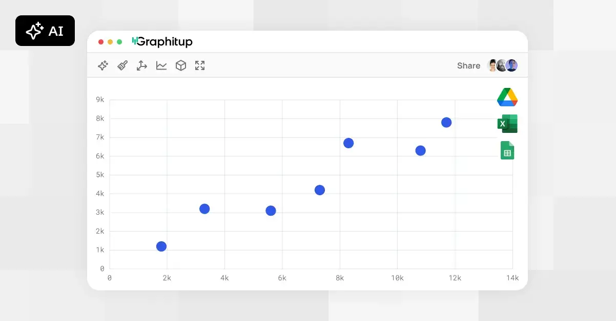 Online Scatter Plot Maker - Free, No Signup
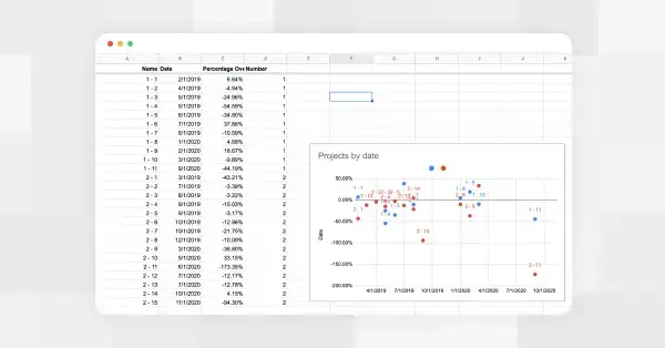 How to Make a Scatter Plot in Google Sheets