Learn about our editorial policies and terms & conditions
Google Sheets follows a similar workflow to Excel, allowing you to keep your entire workflow within Google Sheets. It is a decent option when you don't want to learn another tool and design issues are not a concern.
To create a scatter plot in Google Sheets:
- Place your x-axis and y-axis values into two separate columns.
- Select the full data range.
- Click Insert, then choose Chart.
- In the Chart Editor, set the chart type to Scatter chart.
- Use the Setup and Customize tabs to adjust axis labels, titles, colors, and scales.
- Add a trendline if it adds clarity to the relationship you are showing.
Once your scatter plot is complete, you can share the sheet directly, download the chart as an image, or embed it in other documents.
Google Sheets scatter plots customization can be a bit overwhelming, however with practice it can become easier. For more intuitive styling, on-brand theming, and reusable chart templates, purpose-built tools like our free scatter plot maker can help you create more impactful designs faster.
 Scatter Plot Guide
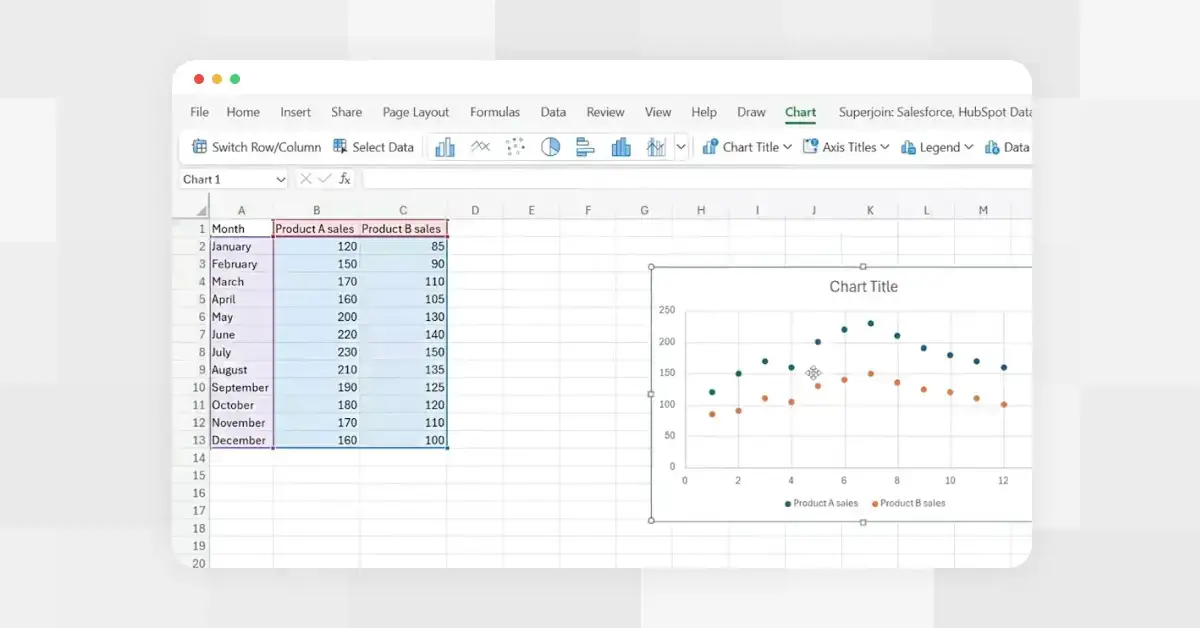 How to Make a Scatter Plot in Excel
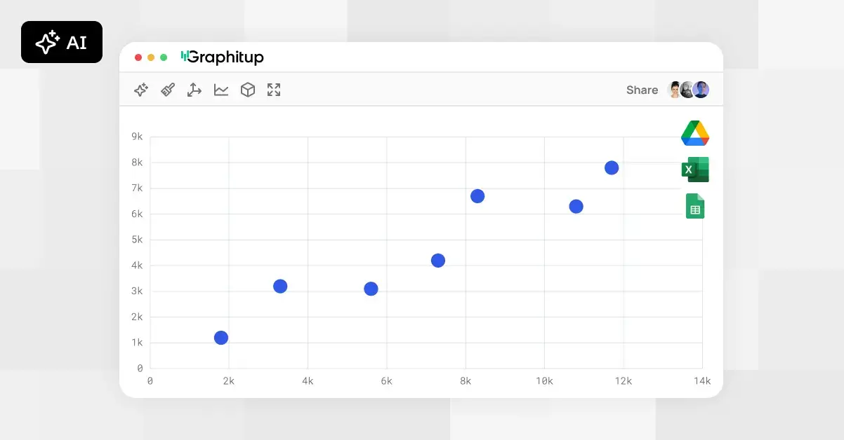 Online Scatter Plot Maker - Free, No Signup