
Learn about our editorial policies and terms & conditions
Key Takeaways
- Bar charts compare categories by using the height of rectangular bars.
- They work best with categorical data when you want to see which groups are bigger, smaller or roughly similar.
- Common types include vertical, horizontal, double bar, and stacked bar charts.
- Good bar charts use a zero baseline, consistent spacing, uniform bar widths, clear labels, and purposeful color.
- Graphitup makes it easy to create, customize, and export bar charts, whether you start from scratch, a template, or AI.
What Is a Bar Chart?
A bar chart (also called a bar graph or column chart) is a simple visual that compares values across categories. One axis lists the categories, and the other shows the scale of the values you're measuring. Each category appears as a bar with equal width, and the bar's length represents its value. That's the entire idea: the longer the bar, the larger the number.
Bar charts are everywhere because they give instant ranking. The tallest bar stands out, the smallest bar is obvious, and everything else falls into place visually. When designed well, they reduce a table of numbers to a picture that takes a second to interpret.
Bar Chart[ˈbär chahrt]A bar chart is a graphical tool that displays categories as rectangular bars whose lengths are proportional to their values, allowing quick comparisons across groups.
What Is a Bar Chart Used For?
A bar chart is used whenever you want to compare categories, and the order of those categories is not the main takeaway. It is ideal when the question is some version of "which is higher and by how much".
Practical uses include:
- Business and finance: Revenue by product line, profit by region, operating costs by department, units sold by channel.
- Marketing and analytics: Traffic by source, conversions by campaign, leads by industry, subscribers by plan.
- Product and operations: Tickets by type, defects by category, orders by shipping method, feature usage by segment.
- Surveys and research: Responses to single-choice questions, reasons selected, satisfaction scores by group, demographic splits.
If your x-axis is a discrete list of categories rather than continuous time or another natural sequence, a bar chart is usually the best starting point.
How To Read a Bar Chart
Reading a bar chart should feel effortless. Start with the title to understand what the bars represent. Then look at the axes: one shows the categories, the other shows the values. Once you know what you're comparing, scan the bars from longest to shortest.
A bar chart's largest element points to the highest value, the smallest bar shows the lowest, and everything in between forms the pattern. A quick check of the labels tells you the exact values if you need them, but the ranking alone often reveals the main insight.
If colors appear, they usually represent subgroups, like comparing two years or breaking each category into components. As long as the baseline starts at zero and the labels are clear, interpreting a bar chart takes seconds.
Parts of a Bar Chart
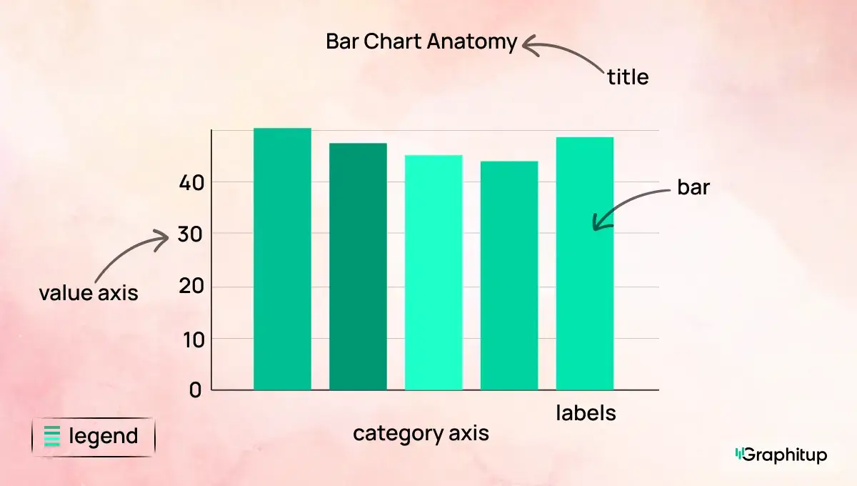
1. Category axis Lists the categories such as products, regions, or response options.
2. Value axis Shows the numeric scale for counts, percentages, or other measures.
3. Bars Rectangles of equal width, spaced evenly. Their length encodes the values.
4. Labels Text for category names and sometimes values. Labels should be readable without guesswork.
5. Legend Explain colors or patterns in double-bar and stacked bar charts
6. Title States what the chart represents in one line.
7. Gridlines or reference lines (optional) Light lines or markers that make it easier to align bars with specific values or targets.
When these parts are clear and uncluttered, the chart will be easy to interpret.
Types of Bar Charts
Here are the four bar chart types you can build directly in Graphitup . While each type serves a slightly different purpose, they all follow the same basic idea: to compare categories in a way that makes differences between them obvious.
Standard Vertical Bar Chart (Column Chart)
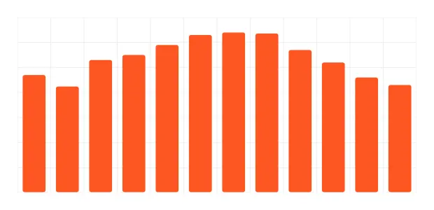
This is the standard version most people picture when they think of a bar chart. Categories sit along the bottom, bars rise upward, and the relative heights tell the story. It's the cleanest way to compare values when you have a moderate number of categories (7-12) and want the ranking to stand out. If someone says "bar chart" or "column chart", this is usually what they mean.
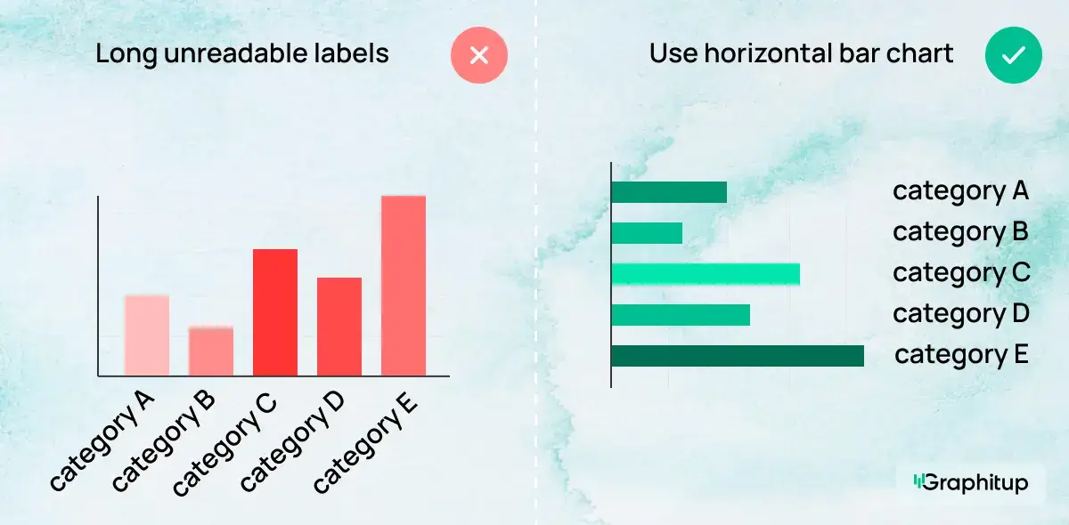
Horizontal Bar Chart
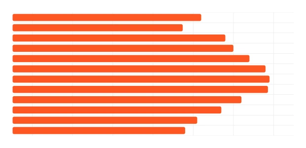
A horizontal bar chart rotates the layout so bars extend left to right while category labels run down the page. This format is perfect when labels are long or when you have many categories that would feel cramped horizontally. The visual logic stays the same — the longest bar wins.
Double Bar Chart (Grouped or Clustered Bar Chart)
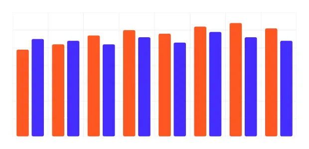
A double bar chart compares two related values within each category. You might show this year vs last year, mobile vs desktop, plan A vs plan B or any paired dataset. Each category contains two bars side by side, making comparisons across and within groups easy to see.
Stacked Bar Chart
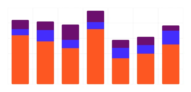
A stacked bar chart combines several subcategories into a single bar. The total height represents the full value, while the colored segments show the internal breakdown. It's useful when you want to see both the overall total and the composition of that total across categories — such as sales by region broken down by plan tier. In stacked bar charts.
it should be noted that only the bottom segments can be accurately compared across categories as they have a common baseline.
Other Bar Chart Types
- 100% stacked bar charts, where all bars represent proportions of a whole and absolute values are hidden.
- Diverging bar charts, where values split from a central baseline.
- Pareto charts, where bars are sorted from largest to smallest and have a cumulative line.
- Broken scale bar charts, which adjust for extreme values but can be misleading.
These versions appear in specialized analysis, but most work is done with the four main types discussed previously.
What Data Do You Need for a Bar Chart?
Bar charts work with data that can be broken into categories, with a number attached to each category.
You need:
1. A categorical variable This provides the labels for the bars. Examples include product names, cities, traffic sources, age bands, or survey answers.
2. A numeric value for each category This can be a count, percentage, sum, average, or any other measure that makes sense to compare across categories.
What matters is consistency. Each bar should answer the same question for a different category. For example, "revenue this quarter by product" or "number of respondents by answer".
Bar Chart Best Practices and Common Mistakes
Bar charts are simple, but small design choices can quietly distort the message. The examples below show the most common mistakes and how to fix them.
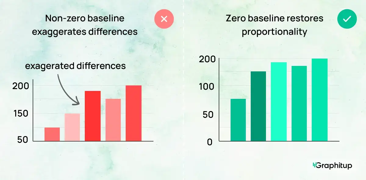
Bad: Axis Doesn't Start at Zero
When a bar chart's value axis starts above zero, small differences can look overly dramatic. Because bar length encodes value, cutting off the baseline exaggerates gaps and misleads the viewer, even if the numbers themselves are accurate.
Good: Start at a Zero Baseline
Starting the axis at zero restores proportionality. The visual difference between bars now matches the actual difference in values, making comparisons honest and easy to interpret.
Bad: Inconsistent Bar Widths or Spacing
Uneven bar widths or irregular spacing introduce patterns that don't exist in the data. The viewer may assume certain categories matter more simply because they look larger or closer together.
Good: Consistent Widths and Even Spacing
Using uniform bar widths and spacing keeps attention on the values, not the formatting. Each category carries equal visual weight, allowing the data to speak for itself.
Bad: Too Many Categories to Read
When a bar chart includes too many categories, labels collide, bars become thin, and comparisons break down. At that point, the chart is harder to read than the table behind it.
Good: Focus on the Most Important Categories
Reducing the number of bars or grouping minor categories into an "Other" bar immediately improves readability. The main comparisons stand out, and the viewer can understand the ranking at a glance.
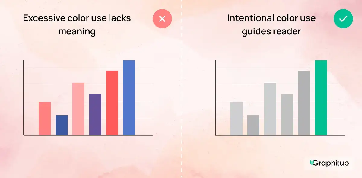
Bad: Every Bar Uses a Different Color
When every bar is assigned a different color, the chart starts to look busy without adding meaning. Multiple colors imply that each category carries special significance, even when the goal is simply comparison. Instead of guiding the viewer's attention, the color palette becomes a distraction. In charts like this, the viewer ends up spending more time decoding color than comparing values.
Good: Use Color to Direct Attention
Using neutral colors for most bars keeps the chart calm and readable. A single accent color can then highlight the category or comparison that matters most, such as a top performer, an outlier, or a specific group you want to draw attention to. This approach makes the message clear without overwhelming the viewer.
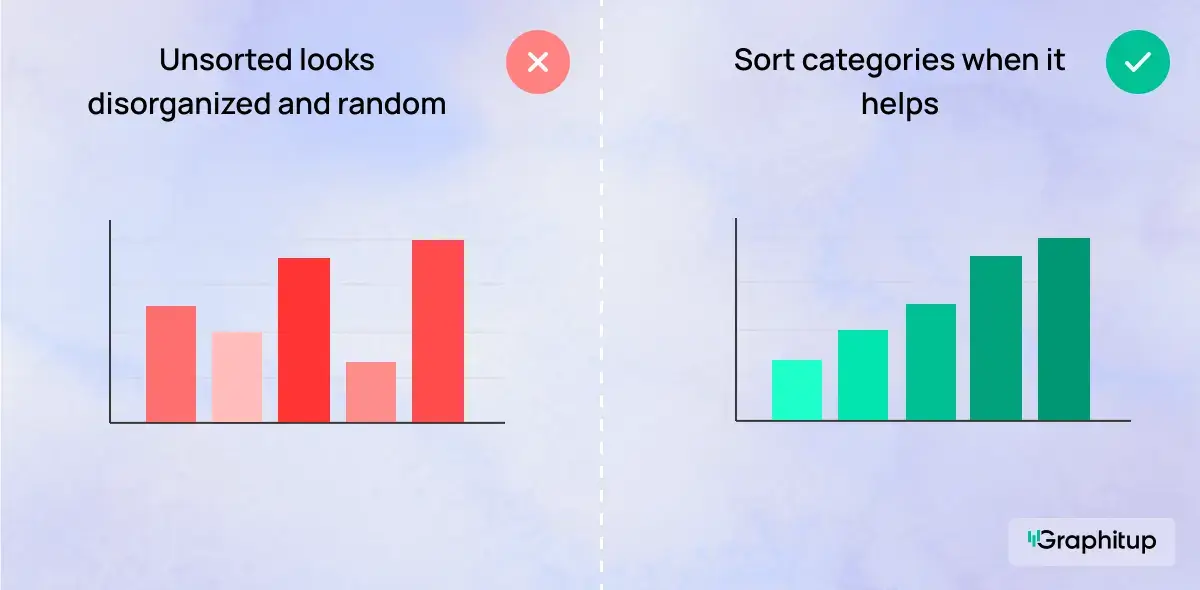
Bad: Categories Shown in an Unsorted Order
When categories don't follow a natural sequence and appear in a random order, comparisons become harder than they need to be. The viewer has to scan back and forth across the chart to figure out which values are highest or lowest, which slows understanding and adds unnecessary effort.
Good: Sorted to Make Ranking Obvious
Sorting categories from highest to lowest value immediately clarifies the comparison. The largest values stand out right away, and patterns become visible without the viewer having to think about them. This works especially well when the goal is to compare performance, size, or magnitude across categories.
How To Make a Bar Chart
You can build a bar chart in almost any tool. Graphitup is designed to handle the practical work quickly, with support for templates and AI when you do not want to start from a blank canvas.
Make a Bar Chart in Graphitup
Graphitup gives you several starting points:
- Bar Chart Maker
- Horizontal Bar Chart Maker
- Double Bar Chart Maker
- Stacked Bar Chart Maker
- AI Chart Maker
- Pre-built bar chart templates
How it works:
- Choose the chart maker or template that matches your use case.
- Upload your data from CSV, Excel, Google Sheets or enter it manually. Adjust colors, labels, ordering, gridlines and spacing to fit your style.
- Export a high-resolution image or embed the chart directly in dashboards and reports.
If you use the AI option, you can describe the chart you want, paste your data and let Graphitup generate a ready-to-edit bar chart in one step.
However if you're looking for basic graphic design and to keep your workflow inside Excel or Google Sheets, your options will be more time consuming. However you can find our guides to creating Excel bar charts as well as our Google Sheets guide here.
Advantages and Disadvantages of Bar Charts
- Easy for most audiences to read without explanation.
- Excellent for comparing categories at a glance.
- Works with many measures, from counts to percentages.
- Supports multiple series through double and stacked bars.
- Resilient to extreme values, which simply appear as longer or shorter bars.
- Hard to read when there are too many categories or stack segments.
- Not suitable when the x-axis is truly continuous or ordered by time.
- It can mislead if scales do not start at zero or if the styling distorts perception.
- Weak for showing detailed distribution shapes or subtle time-based trends.
- Any inconsistency in bar widths or spacing can rapidly become confusing.
Bar Chart Examples
- Channel Performance Across Campaigns
- Salary Comparison
- Steps Taken per Month
- Average Cart Size by Season
- Workforce Distribution by Department
- Revenue vs Expenses Composition by Quarter
- Workforce Distribution by Department
Access our full template library here.
Create Better Bar Charts With Graphitup
A good bar chart answers a comparison question in seconds. It shows which categories are ahead, which are behind and how big the gaps are, without making the viewer work for it.
Graphitup is built to help you reach that point faster. You can start with a Bar Chart Maker, switch to horizontal, double or stacked layouts, or let the AI Chart Maker build the first draft for you. Templates follow best practices out of the box, so you can focus on the story rather than formatting.
If you want bar charts that look polished, stay honest and actually help people understand the data, start with the bar chart tools in Graphitup and move from raw numbers to clear visuals in a few steps.
 Pie Chart Guide
 Line Chart Guide