Learn about our editorial policies and terms & conditions
Key Takeaways
- Line charts show change over time by connecting points—instantly revealing trends like growth, decline, or cycles.
- Use for continuous data when highlighting patterns or comparing a few categories.
- Read by checking axes, following the line, and noting peaks, dips, and slopes.
- Keep clean: clear labels, honest scales, few lines, no misleading smoothing or dual axes.
- Types include simple, multi-line, stacked, smoothed, and step—choose based on your story.
What Is a Line Chart?
A line chart (also called a line graph or line plot) is a simple visual that connects individual data points with straight lines to show how something changes over a continuous scale. In most cases, that scale is time. One axis (usually the horizontal x-axis) shows the sequence, and the other (the vertical y-axis) shows the values you care about. Line charts are popular because they make trends easy to read. If the line moves up, something is increasing. If it moves down, something is decreasing. If it flattens out, nothing much is happening. It turns a pile of numbers into a shape that makes sense immediately.
Typical examples include daily website visits, monthly revenue, temperature readings across a week, or anything that changes in a logical order.
Line Chart[lahyn chahrt]A graph that displays data points connected by lines to reveal trends, patterns, or changes across time or another ordered variable.
What Is a Line Chart Used For?
A line chart is used to show how something changes over time or across any sequence where order matters. It highlights patterns that are easy to miss in a table. The purpose is simple: make trends visible.
Here are some of the most common and practical uses:
- Tracking change over time: If your data is tied to minutes, hours, days, months, quarters, or years, a line chart is usually the best first choice. It quickly shows growth, decline, seasonality, or sharp shifts.
- Comparing multiple trends: If you want to see how several quantities change relative to each other, a multi-line chart makes the comparison obvious. For example, line charts for website traffic by device, revenue across product lines, or workforce distribution by department can quickly indicate trends among different variables.
- Spotting patterns and cycles: Line charts help reveal repeated highs and lows, long-term drift, sudden spikes, or other trends that might require action.
- Monitoring performance against goals: Tracking progress against a target is much easier when the movement is visible. Many teams add a reference line to see whether they are above or below where they should be.
- Making forecasts: A line chart will not predict the future by itself, but it sets up the context for forecasting by showing how the data has been behaving. So, when is a line chart the best choice? A good rule of thumb is to choose a line chart when your data is continuous, sequential, or time-dependent, and when you want to focus on the pattern rather than exact individual values.
How to Read a Line Chart
A line chart should make sense within a few seconds. Start by understanding the axes. The horizontal axis usually shows time or another ordered sequence, while the vertical axis shows the values being measured. Once those two pieces are clear, the rest of the chart becomes much easier to interpret.
Next, look at the overall movement of the line. An upward slope shows growth while a downward slope indicates decline. A flat stretch signals stability. The steepness matters too, since sharp rises or drops often point to important events such as promotions driving sales, outages resulting in sudden drops, seasonal shifts, or data errors.
Peaks and dips help you spot key turning points. High points often mark strong performance, and low points may reveal issues that need attention. If the chart includes more than one line, focus on how the lines relate to each other. Do they move together? Do they separate? Do they cross? These patterns usually tell you more than the individual numbers. Pay attention to how missing data is shown. A break or marker indicates that values were not recorded. A perfectly smooth line over a known gap may hide something meaningful.
Finally, use the labels and notes to confirm what each line represents and how the values are measured. A line chart is simply a visual timeline, and reading it well comes down to following the movement across the axes.
Parts of a Line Chart
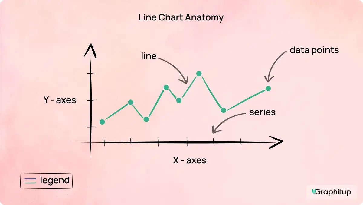
A line chart has a few core elements that work together to make the trend easy to understand. Key parts of a line chart include:
1. The horizontal axis (x-axis)
This axis usually represents time or another sequence that follows a logical order. The spacing should reflect consistent intervals, such as days, months, hours, or stages in a process.
2. The vertical axis (y-axis)
This axis displays the values you are measuring. Units should be clear, and the scale should make it easy to see changes without distorting the story.
3. Data points
Each point marks a specific value at a specific moment in the sequence. On many charts, these points are small, subtle markers, but they form the backbone of the trend.
4. The line or series
The line connects the data points to show how the values move. A single line shows one trend. Multiple lines allow for comparisons across categories or segments.
5. Title and labels
A good title explains what the chart represents in a single line. Both axes should have labels that tell viewers exactly what they are looking at. Without clear labels, interpretation becomes guesswork.
6. Gridlines
Light horizontal or vertical gridlines help viewers understand where each value falls without distracting from the line. These should support the chart, not compete with it.
7. Legend
For charts with more than one line, a small legend identifies each series. The best charts match line colors with legend text colors so readers do not need to jump around.
8. Annotations or highlights (optional)
Occasionally, a specific moment needs context. Annotations can point out events, milestones, or irregularities without overwhelming the design.
Types of Line Charts
Line charts come in several forms, and each is suited for a slightly different purpose. Choosing the right type helps ensure the trend you want to show is clear rather than confusing. The variations below are the most common and useful in real analysis work.
Simple line chart
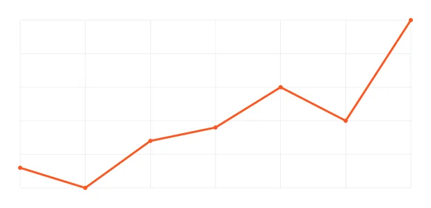
This is the version most people know. A single line shows how one variable changes over time or across an ordered sequence. It is ideal when you want clean, focused storytelling without distraction. Think daily sales, monthly subscribers, or annual temperature trends.
Multi-line chart
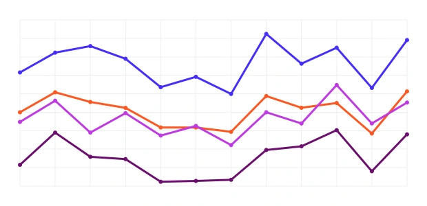
A multi-line chart uses several lines on the same axes so you can compare how different groups or categories behave over the same period. This works well for comparing product lines, regions, customer segments, or any scenario where the shape of the trend matters just as much as the values themselves. The key is to keep the number of lines readable so the chart stays clear.
Stacked or compound line chart
A stacked line chart (also called a compound line chart) shows how multiple data series contribute to a total. Instead of separate lines, each new series builds on top of the previous one, creating a layered shape. This is helpful when you want to see both the overall total and how each part contributes to that total over time. It is often used for categories like revenue streams, user types, or energy sources.
Curved line chart or smoothed line chart
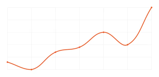
A curved or smoothed line chart rounds out the angles between data points to create a more fluid shape. This style can make a chart easier to read when the exact shape of each transition is not critical. However, it should be used thoughtfully, since smoothing can sometimes imply the existence of data that does not actually occur between points. When clarity is the goal, many teams prefer straight lines to avoid misrepresentation.
Step line chart
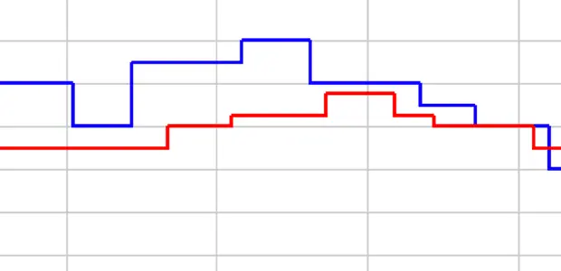
A step line chart moves horizontally before jumping up or down in clear steps. It is perfect for data that changes at specific moments rather than continuously, such as subscription counts, inventory levels, or system states. The stepped format makes the timing of each change very clear.
Line Chart vs Other Charts
Line charts are excellent for showing movement over time, but they are not the right choice for every dataset. A quick comparison helps clarify when a different chart will communicate the story more effectively.
Line chart vs bar chart: Line charts show trends across continuous or ordered data. Bar charts work better for categories that do not follow a sequence, such as product names or survey responses. If the x-axis is not naturally ordered, a bar chart is usually the safer choice.
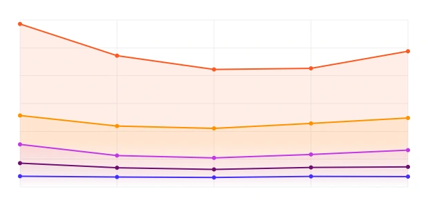
Line chart vs area chart: Both show trends, but area charts emphasize magnitude by filling the space under the line. Use an area chart when totals or volume matter. Use a line chart when the focus is on the direction and pattern.
Line chart vs scatter plot: Scatter plots compare two numeric variables to show relationships. If you are not tracking time and want to see how one value changes with another, a scatter plot is a clearer option than a line chart.
Line chart vs histogram: Histograms show the distribution of values across bins. Use them when you care about the frequency or shape of a distribution. Use a line chart when you care about how values move over time.
*A note on Pareto and stock chart lines: Some charts, such as Pareto charts or stock charts, include lines for specific purposes. A Pareto line shows cumulative percentage. A horizontal line on a stock chart often marks support, resistance, or a reference value. While these are not line charts in the traditional sense, they follow the same visual logic.
Best Practices for Line Charts
- A line chart works best when the trend is easy to see, and the design stays out of the way. A few simple choices go a long way toward making the chart clear and trustworthy.
- Keep the number of lines manageable. Too many lines create visual noise, and viewers end up guessing instead of comparing. You should only use line charts when there are five or fewer lines, and fewer than 20 data points per line.
- Choose a sensible interval for time-based data. If the intervals are too small, the chart becomes noisy. If they are too large, important movement disappears. Pick a scale that reflects how the data naturally behaves.
- Make the axes clear and consistent. Labels should tell the viewer exactly what they are looking at, and the scale should not exaggerate or flatten the trend. A line chart does not always need to start at zero, but the choice should be intentional and honest.
- Use color to guide attention, not to decorate. Each line should be easy to distinguish from the others. Neutral tones help secondary lines fade into the background, while a stronger color can highlight the line that matters most.
- Handle missing data transparently. Use gaps or visible markers rather than smoothing over empty points. A clean break is more accurate than an artificial slope.
- Avoid unnecessary smoothing. Curved lines can look polished but may suggest values between points that do not exist. Use them only when the context supports it.
- Be cautious with dual axes. Two different scales on the same chart can make unrelated trends appear connected. In most cases, separate charts or small multiples lead to clearer and more honest comparisons.
Good and Bad Line Chart Examples
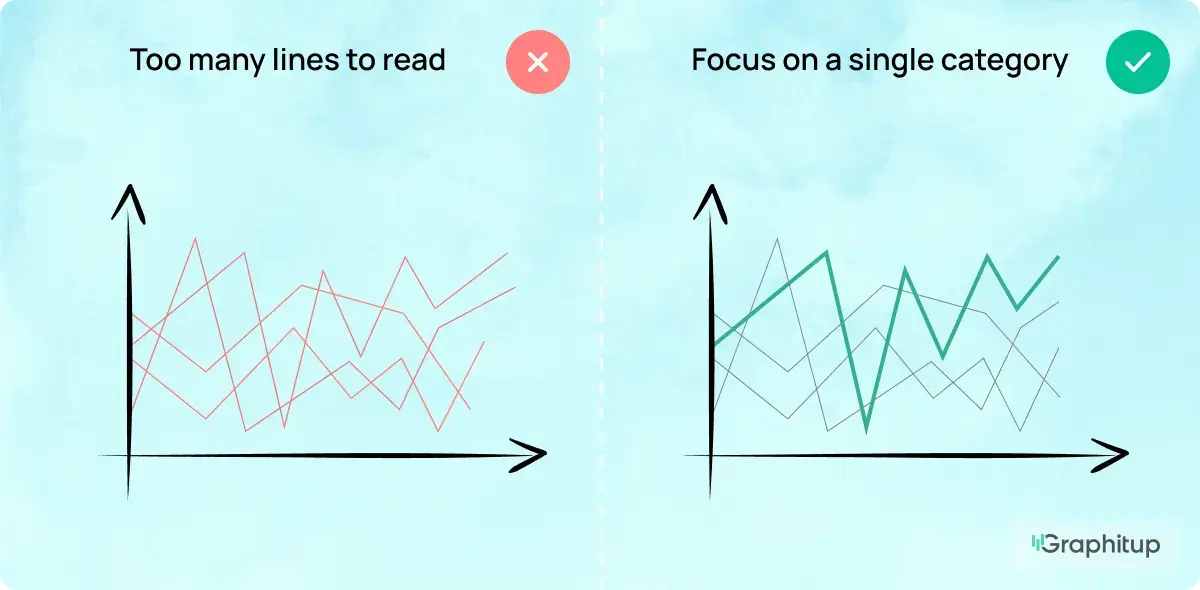
Bad: Too Many Lines to Read
When a chart has too many lines, the viewer cannot tell which trend matters or what story the data is trying to convey.
Good: Focus on a Single Category
Highlighting one line and dimming the rest makes the main trend clear and easy to understand.
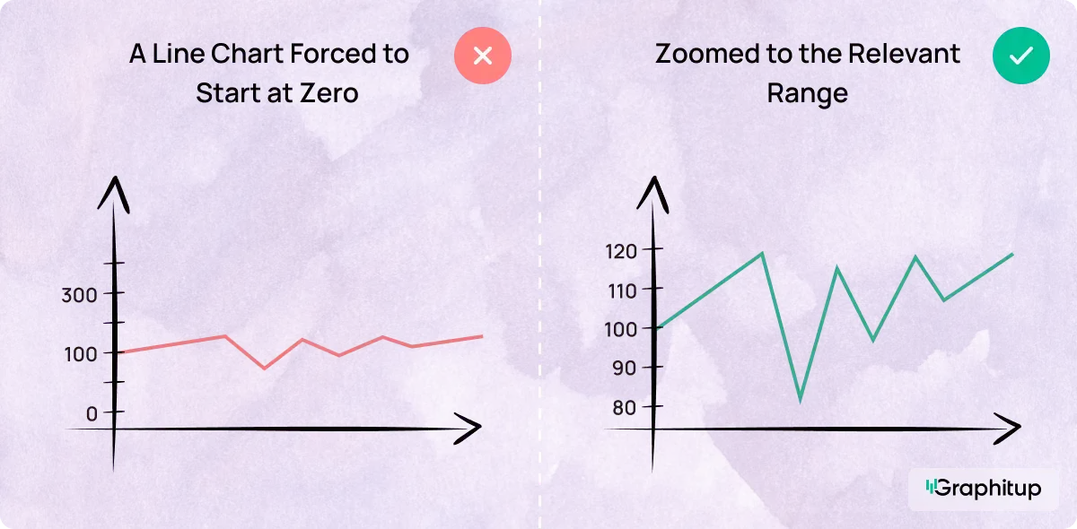
Bad: A Line Chart Forced to Start at Zero
Forcing a line chart to start at zero can flatten important changes and hide the real trend.
Good: Zoomed to the Relevant Range
Starting the axis at a relevant value helps show how the data actually moves.
Advantages and Disadvantages of Line Charts
Line charts are powerful for showing how data changes over time, but like any chart type, they work best when used in the right situations.
Advantages
- Great for showing trends over time
- Easy to compare a few categories on the same scale
- Quick to read, even for non-experts
- Applicable across many time ranges, from minutes to years
- Highlights patterns, cycles, and turning points clearly
Disadvantages
- Becomes hard to read when too many lines are included
- Not suited for categories with no natural order
- Can mislead if the y-axis scale is stretched or compressed
- Not ideal when exact values matter more than the general trend
- Can hide missing data if lines connect across gaps
How to Make a Line Chart
You can create a line chart in almost any tool, but the steps are always similar. Below are quick, simple guides.
How to Make a Line Chart in Graphitup
Graphitup keeps the process simple, whether you want full control or a quick jump-start.
How it works:
- Start by choosing where to build your chart:
- Line Graph Maker
- AI Graph Maker
- Or pick a pre-built line chart template
- Upload your data (CSV, Excel, Google Sheets link, or manual entry).
- Customize the chart: adjust colors, labels, markers, themes, and gridlines to match your style.
- Export in high resolution or embed your chart anywhere.
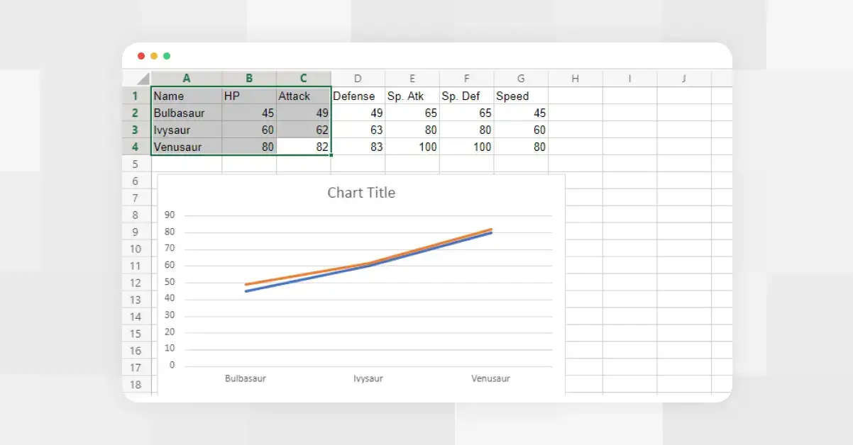
How to Make a Line Chart in Excel
Excel creates line charts quickly once your data is organized.
How it works:
- Organize your data. Put your sequence (such as dates or months) in the first column and your values in the second.
- Create your chart. Select the data. Go to Insert and choose Line Chart.
- Refine the basics. Add axis labels, adjust the scale, and clean up the gridlines to ensure that the trend is clear.
- Add more categories if needed. If you have multiple categories, place each one in its own column before inserting the chart.
Find the full guide here.
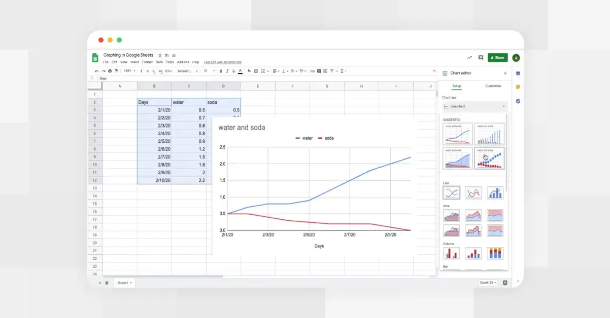
How to Make a Line Chart in Google Sheets
Google Sheets builds charts the same way as Excel, but uses the Chart Editor to control styling.
How it works:
- Organize your data. Add your sequence in one column and your values in the next.
- Create your chart. Highlight both columns and click Insert → Chart.
- Choose the right type. In the Chart Editor, switch the chart type to Line Chart.
- Tidy the visuals. Adjust colors, labels, and axes using the Setup and Customization tabs.
- Share or embed. Drop the chart into a doc, presentation, or shared sheet.
Find the full guide here.
Line Chart Templates
Sometimes you don't want to start from scratch. Templates make the entire process faster, cleaner, and more consistent.
Graphitup offers ready-to-use line chart templates that already follow best practices, so you just drop in your data and tweak the details.
- Email Open Rate
- Traffic by Platform
- CAC Analysis: Cost Trends Over Time
- Historic Stock Price
- Social Media Engagement
- Project Expenses
- Sales Breakdown by Channel
Access our full template library here.
Frequently Asked Questions About Line Charts
What is a line chart in simple terms?
A line chart shows how a value changes over time by connecting data points with a line.
What is the purpose of a line chart?
To make trends easier to see so you can spot growth, decline, or patterns in your data.
What is the difference between a line chart and a line plot?
A line chart focuses on trends over time. A line plot is often used in math or statistics to show individual data points, typically without a continuous time dimension.
What is a stacked line chart?
A stacked line chart shows multiple data series layered on top of each other, allowing you to see both the total and the contribution from each category.
What is the line on a Pareto chart?
It's the cumulative percentage line, which shows how each category contributes to the total.
What is the horizontal line on a stock chart?
Usually, a support or resistance line that marks a price level traders pay attention to.
Is a line chart the same as a graph?
A line chart is one type of graph. All line charts are graphs, but not all graphs are line charts.
When should I not use a line chart?
Avoid line charts when your x-axis isn't continuous or ordered. If your categories don't have a natural sequence (like countries or products), use a bar chart instead.
Create Better Line Charts With Graphitup
If you want your line charts to be clear, accurate, and easy to read, Graphitup makes the whole process faster. You can start with a ready-made template, upload your data, and customize the chart in a few clicks. Whether you're comparing metrics, showing long-term trends, or building dashboards for your team, our tools are built to keep your visuals clean and your message obvious.
Try the Line Graph Maker, explore the template library, and build line charts that actually do their job.