Learn about our editorial policies and terms & conditions
When visualizing trends within your Google Sheets, their line graph tool is the most accessible. Whether you're tracking sales over time, monitoring project metrics, or analyzing any sequential data, you can build a simple line chart in just a few steps.
Here's how to make a line graph in Google Sheets:
- Input Data: Add your data to a new sheet, with the sequence (e.g. dates or months) in one column and the values (e.g. revenue, churn rate) in the next.
- Create a Chart: Highlight the data, click on "Insert" in the menu, and select "Chart".
- Choose Line Chart: If Google Sheets defaults to another chart type, go to the Chart Editor and select "Line chart".
- Customize & Share: Adjust elements like colors, titles, and labels, then share the chart directly or embed it in a report.
While Google Sheets works well for basic line graphs, you might want more design control and professional polish for client presentations or public-facing reports. Graphitup offers a free line graph maker that uses AI to create more visually appealing, on-brand charts in seconds. If you're looking to elevate your data visualization beyond spreadsheet defaults, it's worth exploring as a professional alternative.
 Line Chart Guide
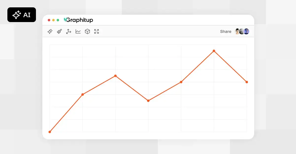 Online Line Graph Maker - Free, No Signup
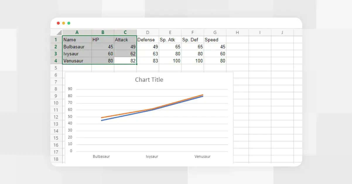 How to Make a Line Graph in Excel
 Types of Line Graphs: Quick Guide to Choosing the Right One
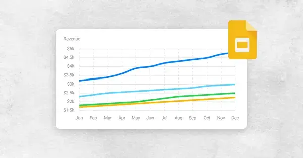 How to Make a Line Graph in Google Slides, in 6 Quick Steps
 Bar vs Line Graph: When to Use Them For Maximum Impact