Learn about our editorial policies and terms & conditions
Creating simple line charts in Excel is straightforward. Whether you're tracking sales trends, monitoring project progress, or analyzing data over time, Excel's built-in tools make it possible to turn raw numbers into simple line charts.
Here's how to make a line graph in Excel:
- Enter Data: Set up your data in two columns: time period in the first, and data values in the second column.
- Insert Chart: Highlight the data, go to the "Insert" tab, and choose "Line Chart". Excel provides options like a basic line, stacked line, or line with markers.
- Customize: Use Excel's formatting tools to adjust colors, add markers for peak points, label your axes, and refine titles.
- Save or Embed: Once you're satisfied, save or export the chart, or embed it directly into reports or dashboards to keep your team informed.
While Excel works well for keeping your workflow within the program, Graphitup 's free line graph maker offers a more powerful alternative for more professional, on-brand visuals. Its AI-powered features help you create polished charts faster that match your brand guidelines automatically—saving time and ensuring consistency across all your reports and presentations.
 Line Chart Guide
 Online Line Graph Maker - Free, No Signup
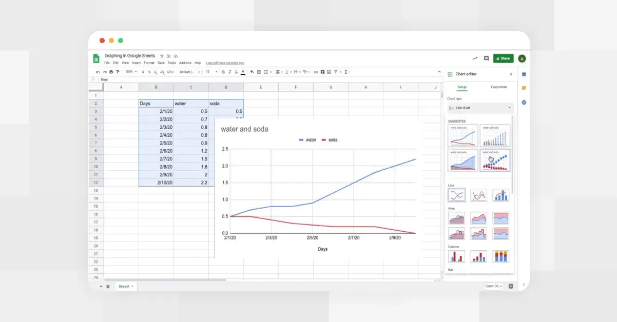 How to Make a Line Graph in Google Sheets
 Types of Line Graphs: Quick Guide to Choosing the Right One
 How to Make a Line Graph in Google Slides, in 6 Quick Steps
 Bar vs Line Graph: When to Use Them For Maximum Impact