Learn about our editorial policies and terms & conditions
When deciding between a bar vs line graph, the key difference is what the x-axis represents. Bar graphs are used to compare categories, while line graphs are used to show change over a continuous range, usually time.
Bar vs line graph
The difference between a bar graph and a line graph comes down to what the data represents. A bar graph is used to compare values across distinct categories. Each bar stands on its own, and the focus is on comparing sizes between groups at a single point in time. A line graph is used to show how values change over a continuous range, most often time. The data points are connected to emphasize trends, direction, and rate of change.
If the goal is comparison, a bar graph is usually the better choice. If the goal is showing change over time, a line graph is usually more appropriate.
What a bar graph is best for
A bar graph works best when you want to compare values across distinct groups that are not inherently connected.
Use a bar graph when:
- You are comparing categories
- Each value stands on its own
- Order is not critical to interpretation
Common examples include survey results, category totals, or comparisons between products, regions, or teams at a single point in time. Bar graphs are good at answering questions like which category is larger or how groups compare to each other.
When not to use a bar graph
Bar graphs are less effective for showing change over time or continuous data. When the x-axis represents a timeline or when trends and direction matter, bars can make patterns harder to see than necessary.
What a line graph is best for
A line graph is best used to show how values change over a continuous range, most commonly time.
Use a line graph when:
- The x-axis is continuous, such as days, months, or years
- Trends and patterns matter more than individual values
- You want to see direction, movement, or rate of change
Line graphs are useful for identifying growth, decline, cycles, or correlations between multiple trends over time.
When not to use a line graph
Line graphs are less effective when data points represent unrelated categories or when connecting values implies a relationship that does not exist. In those cases, a bar graph is usually the clearer choice.
Build your own bar and line graphs
In real workflows, the question a chart needs to answer can change. A comparison may need to become a trend, or a trend may need to be broken into categories. Graphitup makes it easy to switch between bar and line graphs using the same dataset, without rebuilding charts from scratch. Scales stay consistent, layouts remain stable as data updates, and templates can be reused across projects.
Sign up to try Graphitup for free: /signup
 Bar Chart Guide
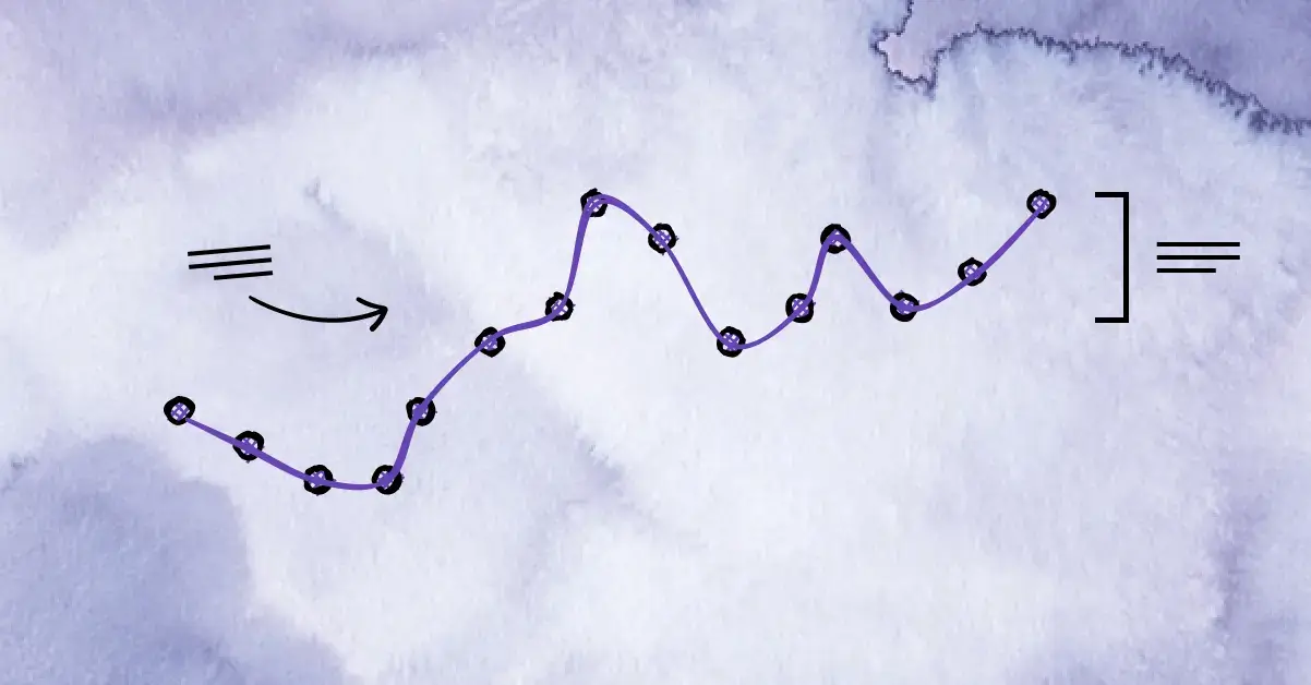 Line Chart Guide
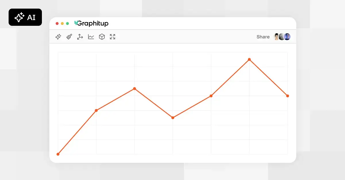 Online Line Graph Maker - Free, No Signup
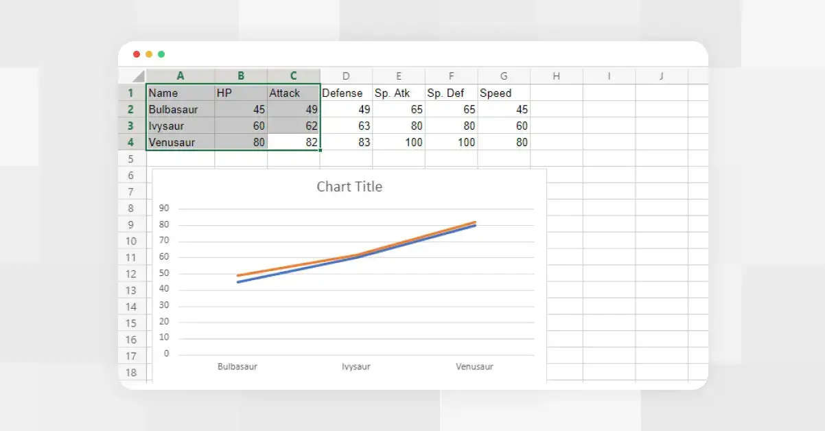 How to Make a Line Graph in Excel
 Types of Line Graphs: Quick Guide to Choosing the Right One
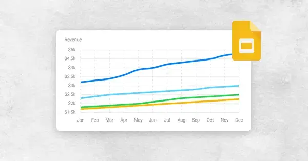 How to Make a Line Graph in Google Slides, in 6 Quick Steps